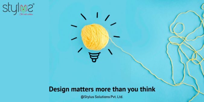
The start of a new decade should be marked with some new and fresh approaches—especially in the ever-changing industry of graphic designing. Don’t you think? So, as we move to the next decade, as a graphic design company in India, what are the things you should avoid? Let’s find out.
When it comes to graphic designing, various designing trends come and go. But, there are few trends that stay longer and others fade away. As a graphic designer and content writers in Mumbai, it is very important to keep an eye on the latest trends and identify their relevance. Setting the right trend or following the right one may help create a powerful brand image and make it stand out.
Through our experience as a graphic design company in Mumbai we have created the following list of design trends that should be avoided.
- Having complex or minute detailing
- Going monochrome and dull
- Using stock photography
- Using every white space
- Using multiple fonts
Let’s learn more about these design blunders.
- Having complex or minute detailing
There are some graphic designers who focus too much on adding intricate details to a design. But, if there is lots of detailing involved, it makes the design look cluttered and difficult to grasp. Instead, you should focus more on simple design that get the point across. After all, we’re in the age of minimalism, where less is more.
- Going monochrome and dull
There was a time when using monochromatic colours or dull colours were considered classy. However, in today’s fast-paced world, standing out triumphs being classy. Recent trend also shows that many companies are taking the 3D approach by combining layers of typography, images and abstract shapes. Pair this with vibrant colours and you’ve found your design hack.
- Using stock photography
It is easy to use stock photography in your designs but they have their own disadvantages. The repetitive use of stock images makes your design look dull, cheap and even unprofessional. People going through your design may recognize them easily as stock images seem to popping everywhere. For any design to appear unique and stand out, you need to go the long way and create your own designs.
- Using every white space
White space is that space in a design that does not contain any texts, images or any elements. It is very important to utilize white space properly. Most of the designers utilize all the white spaces available, making the design look cluttered and unorganized. It is advisable to keep necessary amounts of white spaces between different elements. This will make the design appear more clean, organized and easy-to-understand.
- Using multiple fonts
Do not go overboard with the number of fonts you use in a design. The key to a good design is maintaining consistency and readability. Use of too many fonts can distract and confuse the reader. Make your font choices carefully and consider how many typefaces will be seen together.
A good design is vital for the growth of your business. Stylus Solutions, a leading graphic design company in India, can provide you with some great designs solutions and content writers in Mumbai. You can read more about our services on www.stylusolutions.com or mail us at [email protected].